Denturist Maxident

Project Description
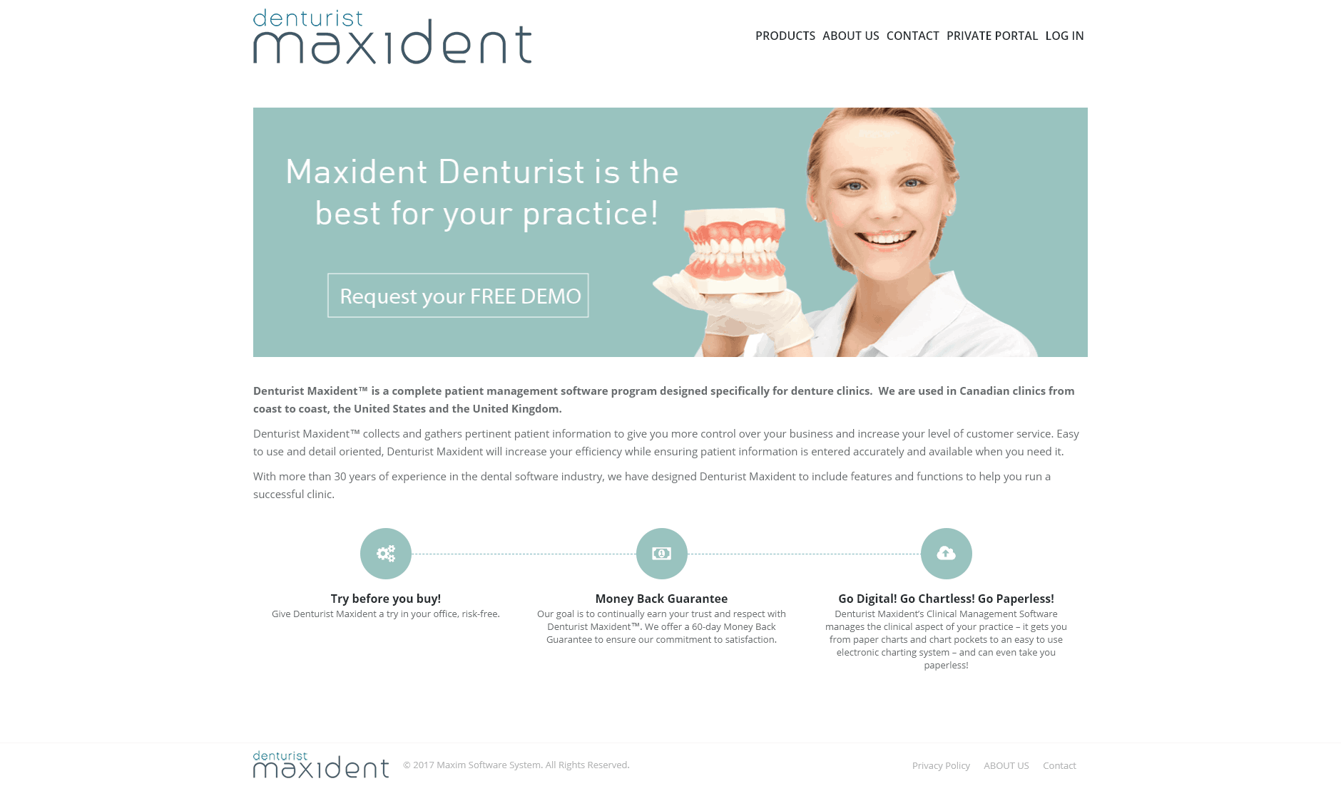
The Denturist Maxident website was incredibly old. They already had other websites and wanted this one to follow the same branding.
- Created the wireframe and the new website using WordPress
- Updated the content for the website as most of the texts had English mistakes or had out-dated information.
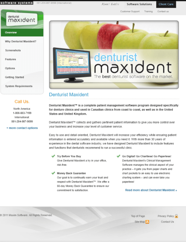
before
The older page was messy, out-dated, and didn’t align with their branding. They needed something modern, clear and easy to navigate. Oh yes, they specifically asked me to get rid of the apples. 🙂
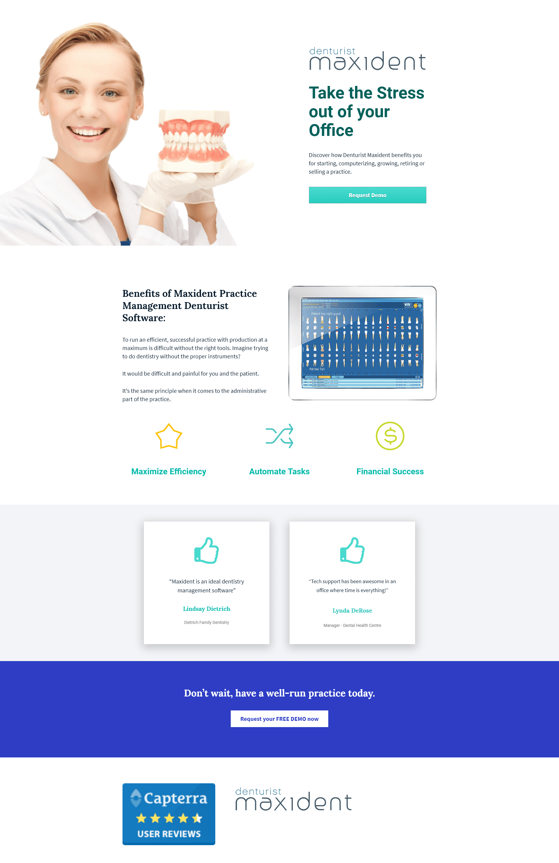
landing page
I also decided to create a landing page so customers could “ask for a demo”.
Before this, they only had the Contact Form and everything (demo requests, support questions, questions) arrived in the same email. Now the new requests go to a new area and everything is much more organized.


